Keep important content available
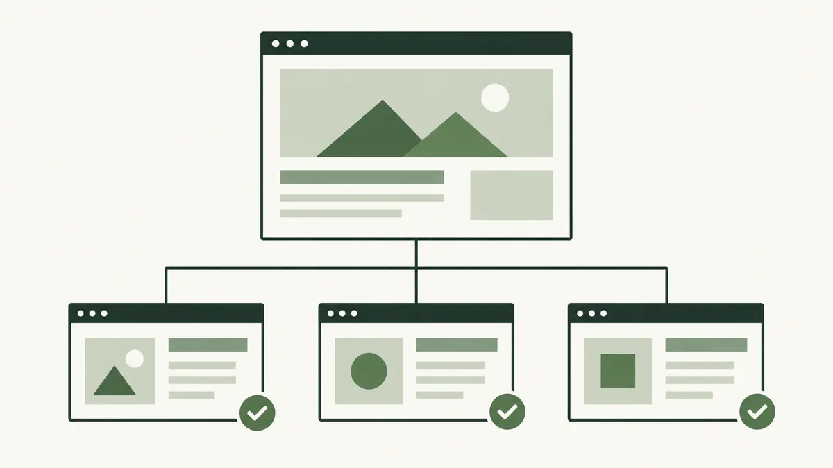
Google uses a site’s mobile content for indexing and ranking. Its mobile guidance recommends equivalent primary content and metadata across versions, with resources that Google can access.
Do not remove service details or ordering conditions merely to shorten the mobile page. Organise them clearly instead. A customer reading on a phone still needs to know the delivery area, minimum order or appointment requirements.
Try one complete customer task
Imagine a bakery customer in Melaka choosing a birthday cake. Begin at the homepage, find the cake options, check the order notice period and open the enquiry form.
Note where you hesitate. A hidden menu label, a cropped size chart or a floating button covering the price can interrupt the task even if the page technically fits the screen.
Test on an actual phone when possible. A narrow desktop browser is useful for layout checks, but it does not reproduce every keyboard, touch or connection behaviour.
Check text, navigation and images
- Read the main text without repeatedly zooming.
- Check that headings and links wrap without being cut off.
- Open and close the menu using touch.
- Look for page-wide horizontal scrolling.
- Check that image crops preserve the useful detail.
A comparison table may need its own horizontal scroll area, but ordinary paragraphs should not force the whole page sideways. Keep labels and controls understandable when space is limited.
Use the image SEO guide to review text alternatives and exports.
Test forms and next steps
Complete a test enquiry using agreed test details. Check labels, required fields, error messages and the confirmation state. Make sure the on-screen keyboard does not leave a crucial control inaccessible.
For a phone or messaging link, verify the destination rather than assuming the button text is correct. A working button that contacts an old number still fails the customer’s task.
Ask the person responsible for enquiries to confirm that the test reached the expected destination, where testing a live form is appropriate.
Record issues that someone can fix
Keep the page address, phone or screen size, the action you tried and what happened. A screenshot can help explain a cropped element; a short sequence of steps is better for a form problem.
- Fix obstacles that prevent reading or completion.
- Recheck the same journey.
- Review representative service and article pages.
- Repeat after changes to shared layouts or forms.
If waiting or delayed reactions are the problem, continue with the page speed guide.